Devblog
Special effects update
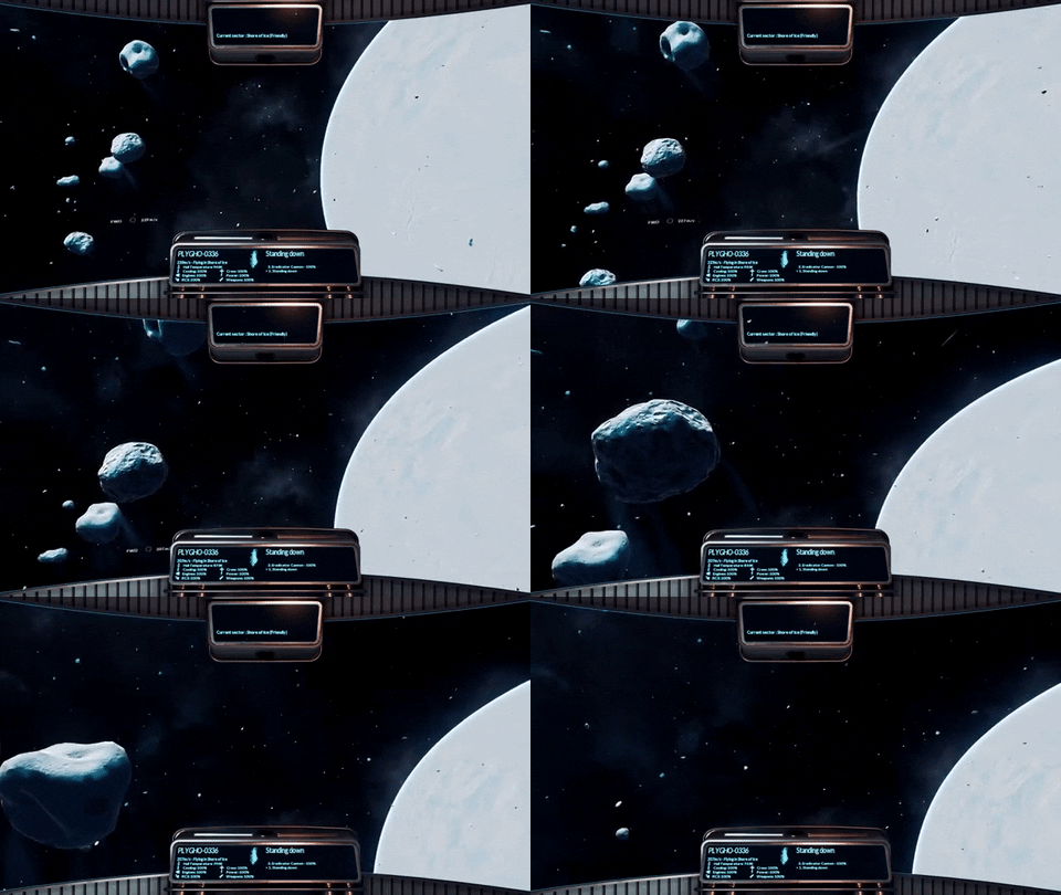
We've been working on making the game look much more dynamic and living. Here's how it looks like...

The game UI is being improved to make navigation between menus a bit easier. A new navigation bar is now present on every menu, so you will be able to issue trading commands while docking to a station. You will also have the option to pause the game when opening a menu, if you don't feel like being attacked while repainting your ships !

Asteroid now melt slightly where the sun is heating them, making them look like comets. Mining sectors feature a rocky debris field. Mining operations generate debris, small boulders that stay in the same area, so these sectors are densely populated with flying rocks ! Rest assured, those are small enough that your ship won't be harmed when colliding with one. They are, however, capable of sending you spinning around the sector, if you don't pay attention.
Here is a shot from the bridge of a Leviathan destroyer, featuring the new combat cockpit, which is much lighter than the freighter version. This is in the same sector as the above gif, this place is called Shore of Ice.

And another screeshot, orbiting a different moon - this is Anka. As usual, this is untouched game rendering, though in 4K with the highest settings ;)

See you soon for more !
